Technology is no more an IT person’s domain, but it exists in each and every place now you can think about. The fact that people can access websites through any of the smart devices is alarmingly convenient and fast. Now you do not be stuck to your PCs and laptops, but use smartphones, tablets and a number of other gadgets will help you view the world right at your fingertips.
What more, we cannot forget the devices that respond to our commands like everyday appliances like washing machine, refrigerators, televisions, air conditioners etc. They make our like so much easier and are programmed to do chores at particular times so doesn’t that save us a lot of time!
Now due to the vast usage and dependence on smart devices for daily searches and transactions, the web and mobile developers have always come up with exciting services to meet this challenge and two upcoming methods that have hit the technological market are: adaptive design and the responsive design. Let’s check them out further.
Adaptive Use Technology
What does adaptive mean in short? Of course, it is the ability to adjust and change according to the situations, to the environment and survive successfully. This was the idea behind this design when it was created; as web developers understand when the people use their devices they do not know or consider anything about the applications that are used for it. So, for them, it is advisable that a standard application or design is used for all devices.
The Adaptive Design recognizes which device is being used and accordingly switches to the right set of designs and applications that match the device. So, as per screen size of the device, developers set various layout designs and use applications like Javascript and CSS. According to the Adaptive Use Technology, it adapts the technology or rather changes the technology required by the device that connects to the website.
Responsive Use Technology
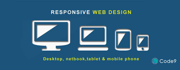
Now the next type of technology is Responsive Type. As the name is self-explanatory, it is a web technology that responds and automatically customizes the screen according to the queries, and requirements of the customer or the one who views the website. Everything about a responsive design is that it is basically flexible to changes. The screen will identify the requests put forward by the web visitor, give the options accordingly to match their preferences and so that the best possible solution is procured to the full benefit of the visitor.
The main merit that we can come across in a Responsive Web Design it works well on each and every screen size, and device with no fuss or not much changes, so making it easier for the experience to be smooth.
What are their Similarities and their differences?
Similarity: Meant for all Devices!
The biggest similarity is that both these types of technology can be effectively used to view and be used in mobiles and all technological gadgets of various sizes. Though both aim at converting the screens to the satisfaction of the viewers, it has been noticed that the responsive use technology is more fluid in its movements along the various grids whereas if you notice the adaptive use technology, it works well along specific screen sizes and parameters.
Differences
– Conversion Process:
A further study into both will help you identify that the Adaptive Use Technology takes in a layered and more streamlined method of display and utilizes scripts and codes to adapt and convert one basic screen or platform to the desired screen and platform that the visitor connects from.
In the case of Responsive Use Technology, since it moves fast like fluid, it is smooth and so the user will not feel any hitches or blockages as the transitions take place to form one device or screen size to the other.
For example, if you take the American Airlines, you will notice that it hold an auto-detection system of a script that offers an elegant presentation. The website identifies the device that connects virtually to it and delivers the appropriate version for the same. The appropriate version would mean the visual display would change in design, size, font, template and even the content may change according to the device that is being used. What the company uses here is Adaptive Use Technology as they have already loaded various versions of their website and whichever device comes in contact with the website, they match with the right scripts and transfer information.
– Cost:
Adaptive Use Technology is more expensive and it was a system that was designed at an earlier stage than Responsive Use Technology. The reason why Responsive Design is cheaper is that it uses CSS application.
– Audience:
If you are dealing with a large audience, like in the American Airlines, we recommend Adaptive Technology because it is more sturdy and can withstand the overflow of visitors. Since the application is complex, the number of developers working on such work is also more experienced and visitors will have a steady flow of communication as required.
Responsive Use Technology is trendy by will not handle a large number of people at the same time and they are chances that it may stick in the due process. But if you are a designer company, we would suggest that you go for responsive platforms, as the choice and customization factor have to be taken into account. A responsive design will give displays with options for colors, combinations, cost comparisons and much more.
So, essentially it is the purpose of your website that decides which technology you should opt for. Both are equally competent, but the way they work is different. From the above points, you must take into consideration the type of products or services you serve, the type of targeted audience, your budget, your future goals and also the general culture of the company, as all these reflect in the way the website is displayed over devices.
So, either can be used and you can be sure that they will update their designs and templates as more and more devices stream down into the online technological market.
About the Author: ANAKHA is a Content Writer at Code9 Technologies, a Web design company in Cochin, Kerala.